

When it comes to chic color palettes for modern home decor, you've got plenty of options to express your style. You might opt for a minimalist monochrome look, using various shades of gray for a sophisticated vibe. If you're drawn to warmth, try earthy neutrals with pops of terracotta or rust. For a luxurious feel, bold jewel tones like emerald and sapphire can create stunning focal points. Soft pastels offer a serene atmosphere, while Scandinavian-inspired cool hues bring tranquility. Nature lovers can embrace green and brown tones for an organic, cozy ambiance. Each palette offers unique ways to transform your space and reflect your personality.
Key Takeaways
- Minimalist monochrome interiors use various shades of gray for a calming, sophisticated atmosphere.
- Earthy neutrals paired with warm accents create a tranquil and comforting space.
- Bold jewel tones add luxury and depth when balanced with neutral bases.
- Pastel hues offer a serene and inviting atmosphere, perfect for refreshing spaces.
- Scandinavian-inspired cool hues transform rooms into tranquil oases with crisp whites and soft blues.
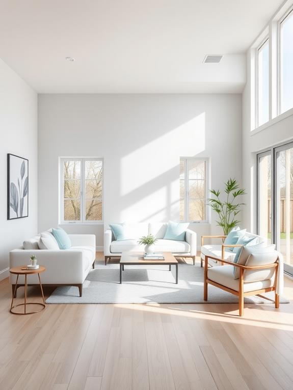
Minimalist Monochrome Magic
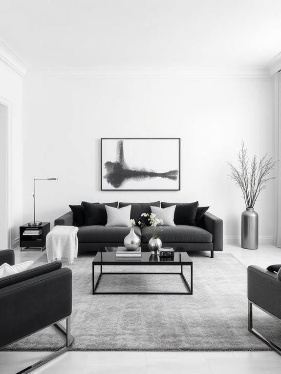
Simplicity reigns supreme in minimalist monochrome interiors. You'll find a calming sense of balance in these spaces, where shades of a single color create a harmonious backdrop for your life. Picture a living room bathed in various tones of gray, from soft dove to deep charcoal. It's not stark or cold; instead, it's a canvas for texture and subtle contrast. While site enhancements are underway to improve user experience, now is the perfect time to plan your minimalist monochrome makeover. Focus on creating a space that prioritizes tranquility and visual harmony.
You can add depth to your monochrome palette by mixing materials. Imagine a plush velvet sofa against a matte painted wall, or glossy ceramic vases on a rough-hewn wooden table. Don't forget to play with patterns too. A striped throw pillow or a geometric rug can add visual interest without disrupting the cohesive color scheme. By embracing this style, you'll create a sophisticated and serene home that's both timeless and on-trend.
Earthy Neutrals and Warm Accents
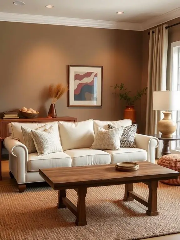
In recent years, the allure of earthy neutrals paired with warm accents has taken the design world by storm. You'll find this palette brings a sense of tranquility and comfort to any space. Start with a base of soft beiges, warm grays, and muted taupes for your walls and larger furniture pieces. Then, add pops of terracotta, rust, or deep olive to create visual interest and depth. This color scheme is perfect for creating a cozy fall atmosphere in your study or workspace, inviting productivity and relaxation.
To bring this look to life, incorporate natural textures like woven baskets, wooden elements, and plush textiles. You'll love how these materials complement the earthy color scheme. Don't forget to add some greenery – houseplants thrive in this environment and contribute to the organic feel. With this palette, you're creating a space that's both on-trend and timeless, inviting you to relax and unwind in your own personal oasis.
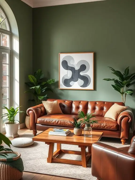
Bold Jewel Tones
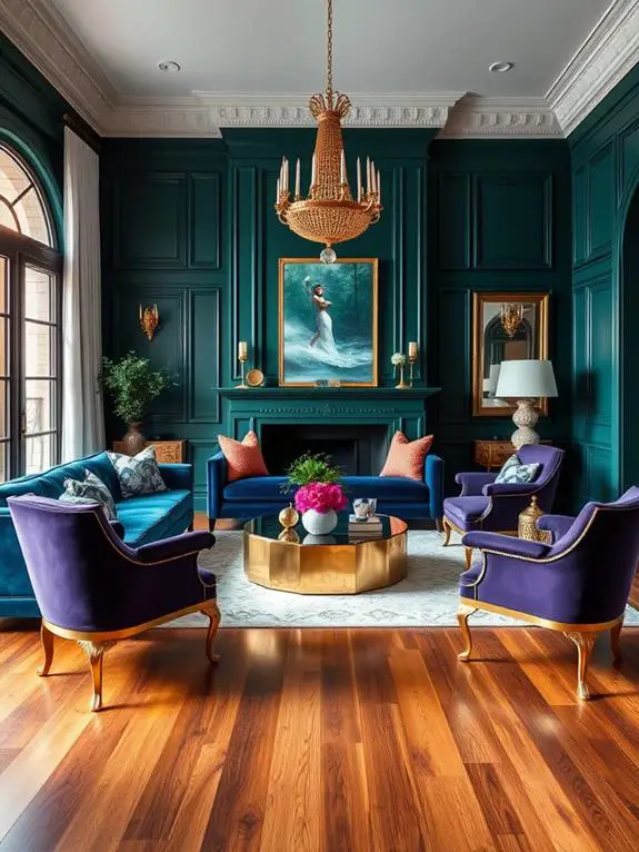
Opulence reigns supreme when you embrace bold jewel tones in your home decor. Picture rich emerald greens, deep sapphire blues, and lustrous amethyst purples adorning your living spaces. These vibrant hues create a luxurious atmosphere that's both inviting and sophisticated. Consider extending this color palette to your bathroom for a cohesive look throughout your home. Spring-inspired decor can breathe new life into your bathroom space, complementing the bold jewel tones used in other areas.
To incorporate jewel tones effectively, start with a neutral base and add pops of color through accent pieces. A velvet emerald sofa can become the focal point of your living room, while sapphire blue throw pillows add depth to a bedroom. Don't shy away from mixing jewel tones; they often complement each other beautifully. For a cohesive look, choose one dominant color and use others as accents. Remember, a little goes a long way with these intense shades. Balance is key, so pair your bold choices with softer neutrals to create a harmonious and elegant space you'll love coming home to.
Pastel Perfection
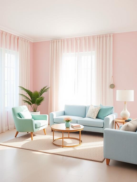
While bold jewel tones make a dramatic statement, pastel hues offer a softer approach to color in home decor. You'll find that these gentle shades create a serene and inviting atmosphere, perfect for spaces where you want to unwind. Think of blush pinks, mint greens, and sky blues that whisper tranquility rather than shout for attention. These soothing colors can even transform your outdoor living spaces, making them perfect for spring rooftop gardens where you can relax and enjoy the warmer weather.
To incorporate pastel perfection into your home, start with a neutral base and layer in soft colors through furnishings and accessories. A pale lavender throw pillow here, a buttery yellow vase there – these subtle touches add warmth without overwhelming the senses. Don't be afraid to mix pastels, either. They play well together, creating a harmonious palette that's both invigorating and timeless. Remember, the key to pastel success is balance. Too much can feel saccharine, but just the right amount will leave your space feeling like a breath of new air.
Scandinavian-Inspired Cool Hues
Scandinavian design's cool-toned color palette has captured the hearts of interior decorators worldwide. You'll love how these serene hues can transform your space into a tranquil oasis. Start with a crisp white base, then layer in soft grays, pale blues, and gentle greens. These colors evoke the misty fjords and snow-capped mountains of the Nordic landscape. While primarily used indoors, these cool hues can also be incorporated into your outdoor lounge areas for a cohesive design aesthetic that extends beyond your home's walls.
Don't be afraid to add warmth with natural wood accents and cozy textiles. A sheepskin throw draped over a sleek chair or a stack of birch logs by the fireplace will bring balance to the cool tones. Remember, it's all about creating a harmonious blend of light and texture. By incorporating these Scandinavian-inspired hues, you'll craft a space that's both rejuvenating and inviting – perfect for unwinding after a long day.
Nature-Inspired Green and Brown
Green and brown, the colors of earth and growth, offer a revitalizing shift from cool Scandinavian hues. These natural tones bring warmth and tranquility to your living spaces, creating a cozy retreat that connects you with the outdoors. As the seasons change, these colors are perfect for fall veranda decor, allowing you to extend your home's autumnal charm to outdoor spaces. You'll feel embraced by nature's palette as you incorporate these earthy shades into your home.
To envision this color scheme, picture:
- A deep forest green accent wall paired with walnut furniture
- Olive throw pillows nestled on a chocolate brown leather sofa
- Sage green curtains framing a view of lush trees outside
- A rustic wooden coffee table adorned with potted succulents
Frequently Asked Questions
How Do I Choose the Right Color Palette for My Home's Architecture?
Did you know that color can influence mood by up to 80%? To choose the right color palette for your home's architecture, start by considering your home's style and era. You'll want to complement its features, not clash with them. Think about the natural light in each room and how it'll interact with your chosen colors. Don't forget to reflect your personal taste – after all, you're the one living there! Experiment with swatches and trust your instincts.
Can I Mix Different Color Palettes Throughout My Home?
You can mix different color palettes throughout your home. It's a fantastic way to create unique spaces that reflect your personality. Start by choosing a unifying element, like a neutral base color or a repeating accent hue. This'll help tie everything together. As you move from room to room, shift gradually to maintain a sense of flow. Don't be afraid to experiment – your home should feel like you! Just remember to balance bold choices with calmer areas for a harmonious overall look.
What Are the Best Paint Finishes for Different Rooms?
You'll be astounded by how much paint finishes can transform your home! For your living room and bedrooms, opt for a velvety matte finish that'll wrap you in cozy comfort. In bustling areas like kitchens and bathrooms, semi-gloss is your best friend, repelling moisture and stains with ease. Don't forget the hallways – an eggshell finish strikes the perfect balance between durability and subtlety. For a touch of drama in dining rooms, a soft satin finish will make your walls glow with warmth.
How Often Should I Update My Home's Color Scheme?
You don't need to update your home's color scheme too often. It's best to refresh your space every 5-7 years, or when you feel it's no longer reflecting your style. However, if you're itching for change, start small with accent pieces or a feature wall. This way, you'll keep your home feeling fresh without breaking the bank. Remember, your home should be a cozy reflection of you, so trust your instincts and have fun with color!
Are There Color Palettes That Can Make Small Spaces Appear Larger?
You'll be thrilled to know that certain color palettes can indeed make your small spaces feel larger! Light, cool tones are your best friends here. Think soft blues, gentle grays, and crisp whites. These colors reflect light, creating an airy, open feel. Don't shy away from pale yellows or greens either; they can add warmth without closing in the space. Remember, it's not just about the walls – consider your furniture and decor choices too. They all work together to create that spacious illusion you're after.